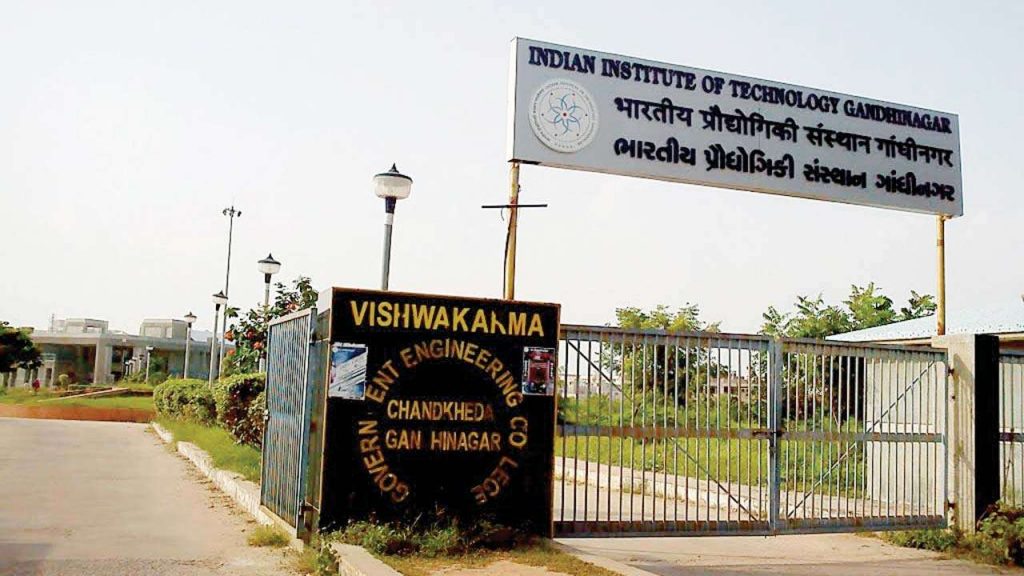
New Delhi: Researchers at IIT Gandhinagar have developed an interactive COVID-19 dashboard. They said it can help administrators, hospitals and the public in planning optimised testing for coronavirus. The dashboard can also contain community infection in various post-lockdown scenarios. The dashboard provides different epidemiological scenario-specific information at a city-scale, said the researchers.
Process the dashboard works
The dashboard is called ‘MIR AHD Covid-19 Dashboard’. It integrates the complex social and transportation patterns with state-of-the-art epidemic spread models. It also helps in testing, quarantining and contact tracing rates.
Comment of one research scientist
“MIR AHD Covid-19 is intended to disseminate information to stakeholders and the public. It can help them make research-backed decisions during the time of crisis,” informed Udit Bhatia. He is an assistant professor of Civil Engineering at IITGN, and one of the lead researchers of the project.
“This model relies on our US patented technology that takes into account the travel preferences in the town. It ranks different road segments according to their relative importance in the network,” Bhatia informed. He said the team is discussing the project with different government agencies who can utilise this dashboard to handle different scenarios.
The researchers, including Prasanna Venkatesh B from IITGN, noted that the machines will be useful in densely populated areas. Intra-community and inter-community interactions becomes an important accelerator in disease spread and this dashboard can prevent that,” Ventaesh said.
Helpful for policymakers
The dashboard is also helpful for policymakers and administrators. It can simulate the rate of COVID-19 spread in various zones of a city under different lockdown strategies. Through this simulation process the community spread of coronavirus can be prevented.
For the general public, the dashboard provides real-time information on the number of cases for all the districts, the researchers said.
Mapping benefits
The dasboard can provide maps of the red, green and orange zone, and COVID-19 hospitals, according to the researchers. It also provides location of government testing laboratories. It also has an interactive slider to choose travel paths in case the users want to avoid travelling through certain routes.
The team is using census 2011 and 2020 population data for city, combined with land-use maps.
The initial testbed for the dashboard is Ahmedabad, the researchers said. They informed they are working on expanding the model to other Indian cities and states which have been identified as hotspots.
PTI
